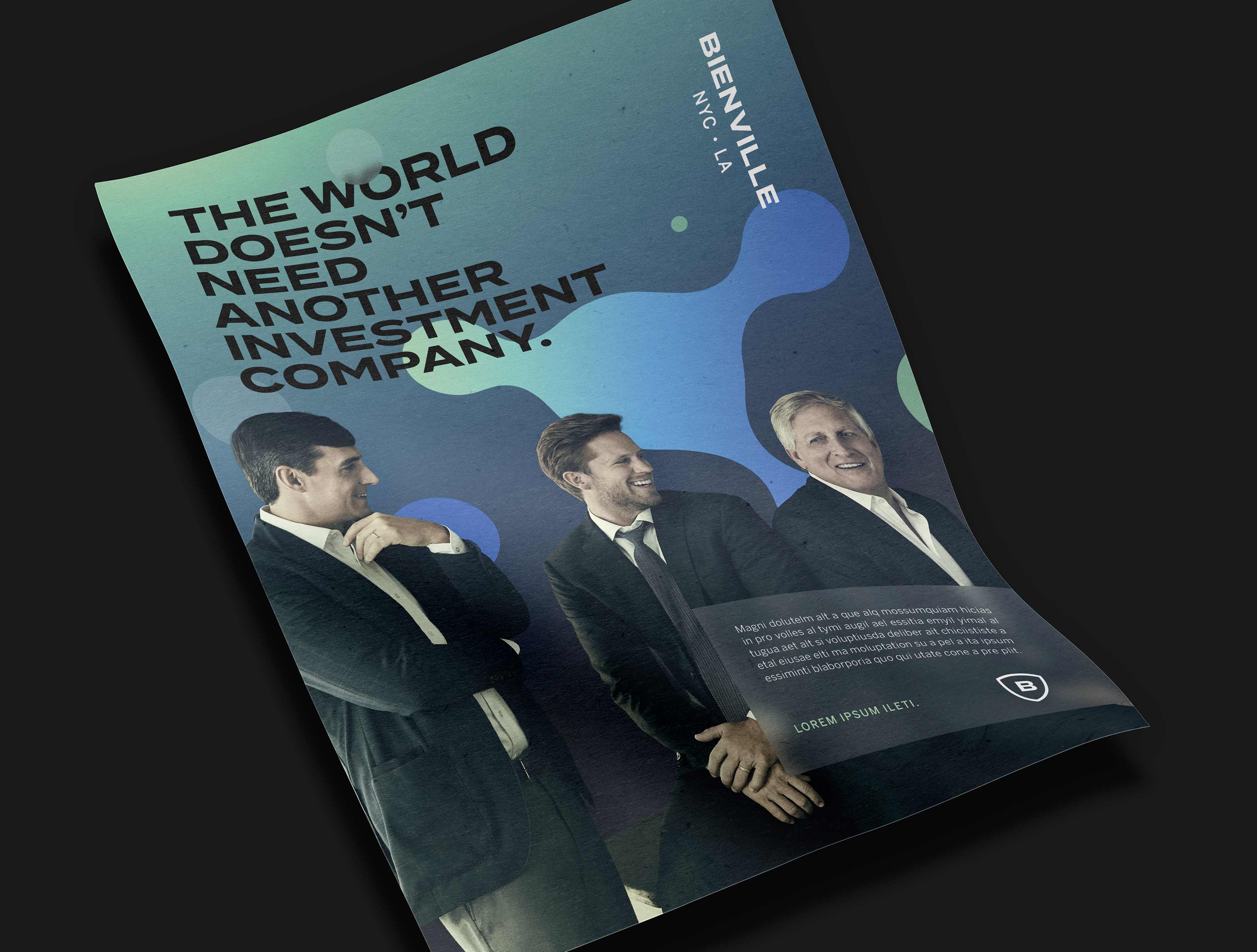
THE BRAND
The world doesn't need another investment firm. It needs great ideas. Bienville Capital is a New York City-based investment firm with a nontraditional approach to asset management looking to disrupt the landscape.
THE ASSIGNMENT
As the firm continues to grow into new categories and push the bounds of conventional thinking, a new digital presence and reimagined visual identity is needed.
THE SOLUTION
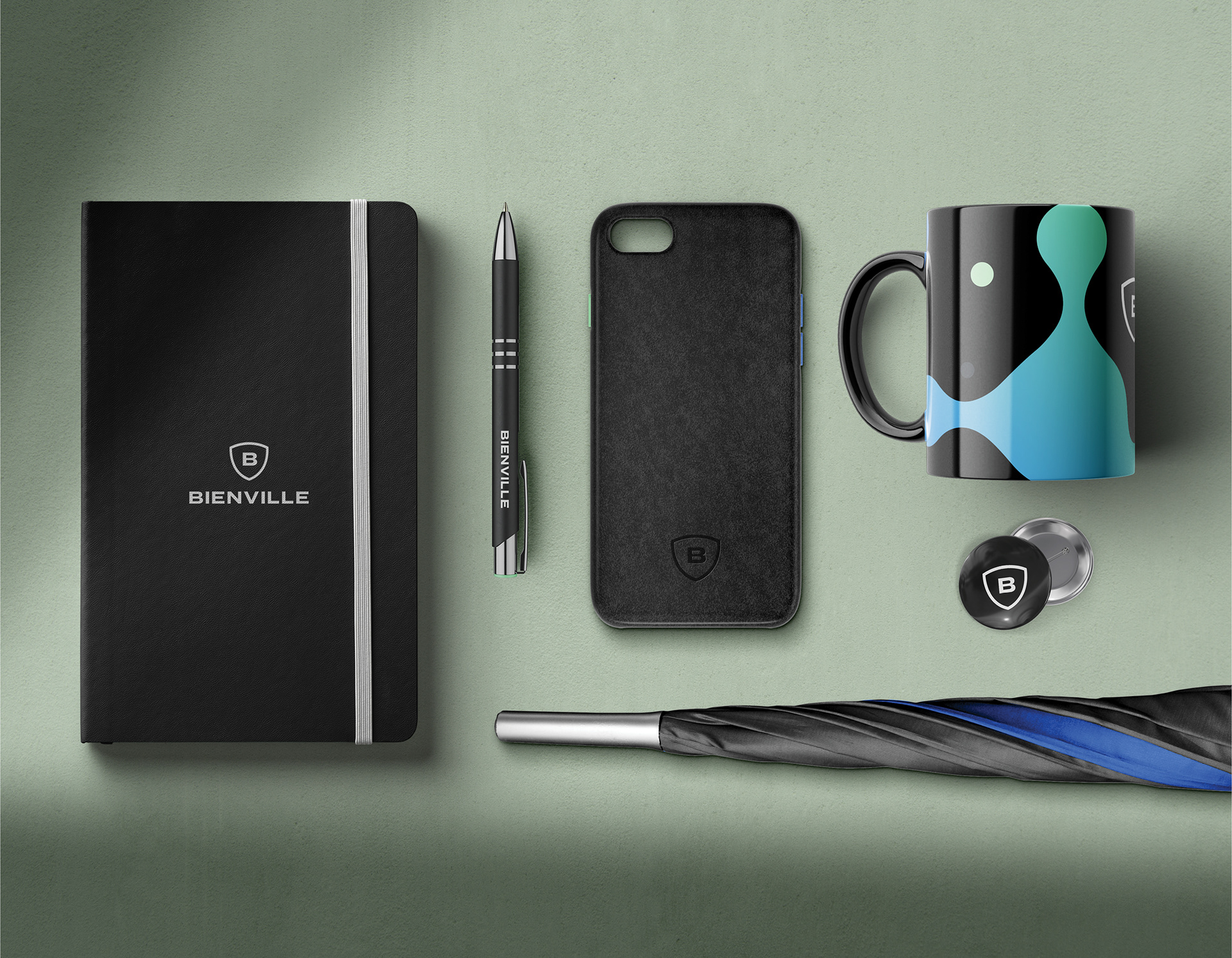
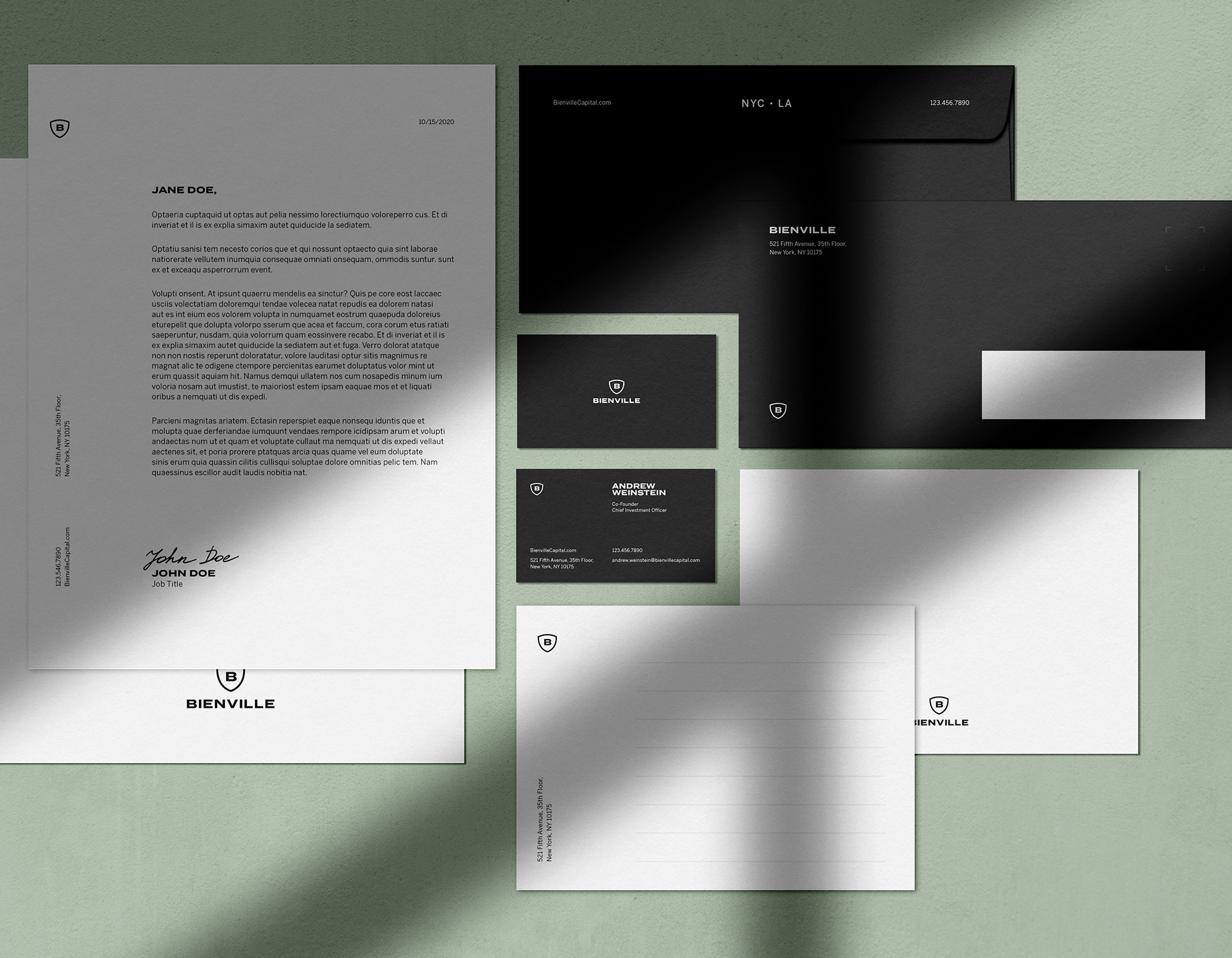
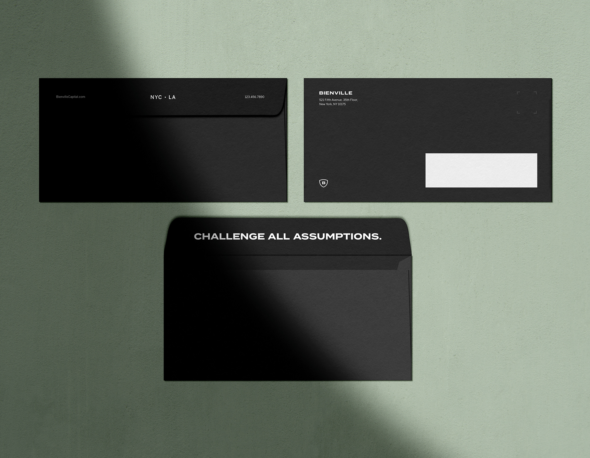
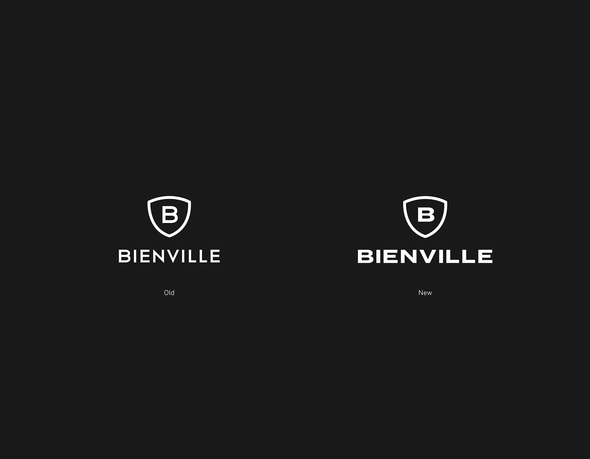
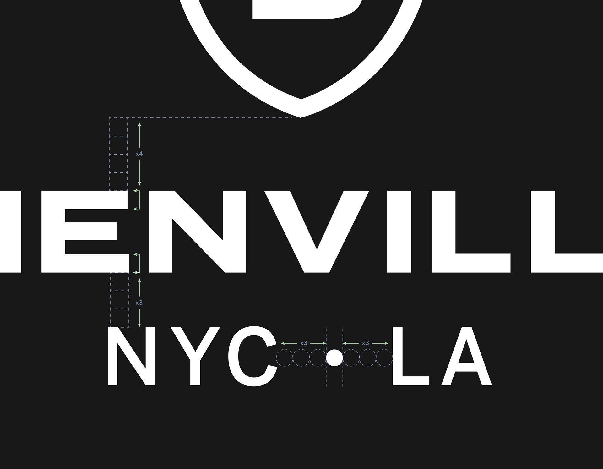
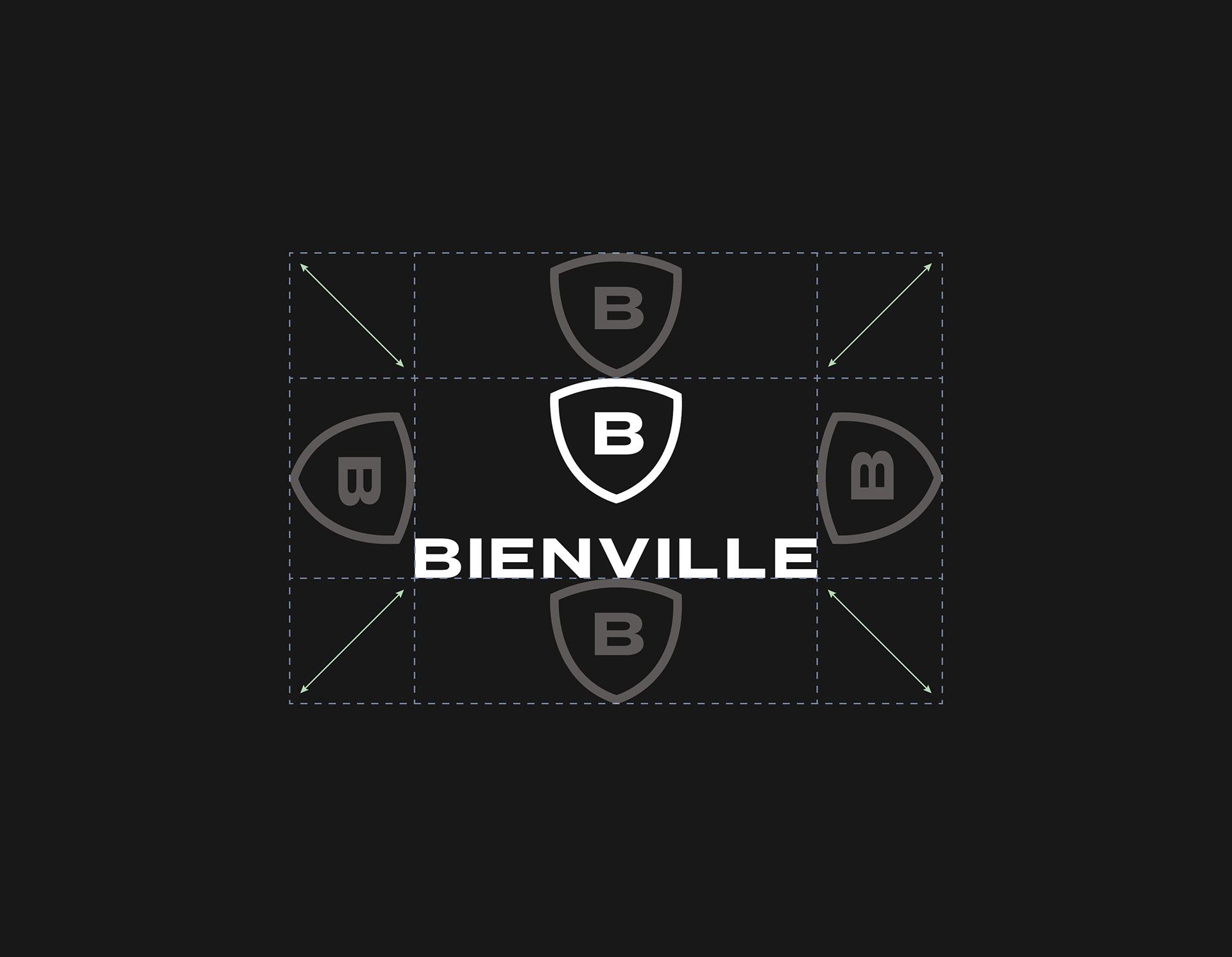
The first step to elevating Bienville’s look among a crowded landscape of investment firms was to refresh their logo by restoring purpose and simplifying complex shapes that failed to scale well. The previous mark featured small sharp serifs embellishing the B initial that lost legibility at medium to small sizes. The word mark was thin and airy—contrary to the brand messaging. Each of these issues were addressed to recreate a new, more confident logo built with purpose and a hint of attitude.
The first step to elevating Bienville’s look among a crowded landscape of investment firms was to refresh their logo by restoring purpose and simplifying complex shapes that failed to scale well. The previous mark featured small sharp serifs embellishing the B initial that lost legibility at medium to small sizes. The word mark was thin and airy—contrary to the brand messaging. Each of these issues were addressed to recreate a new, more confident logo built with purpose and a hint of attitude.
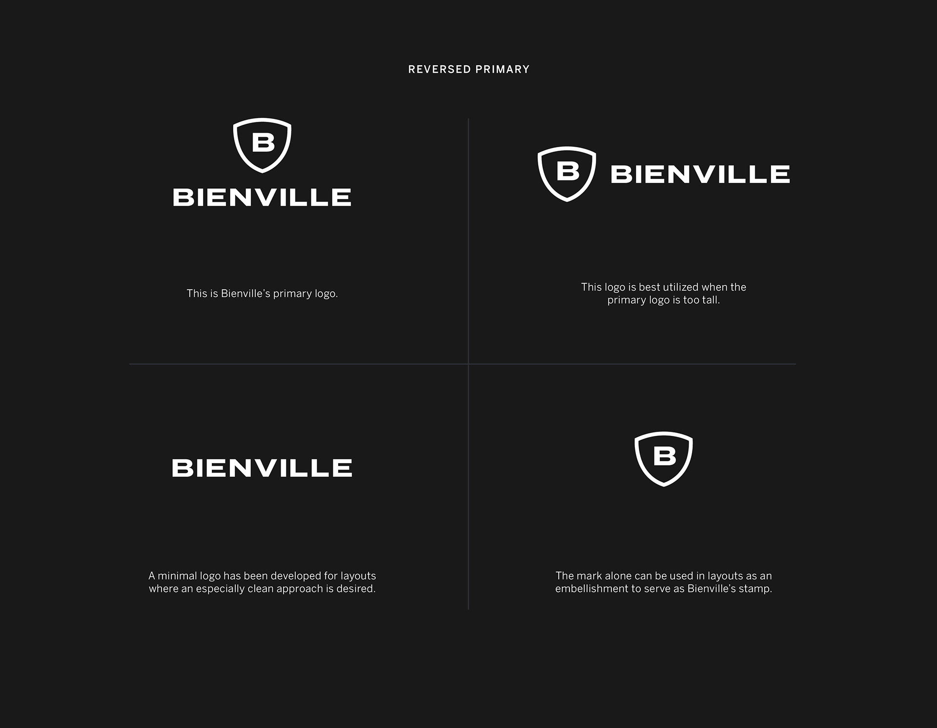
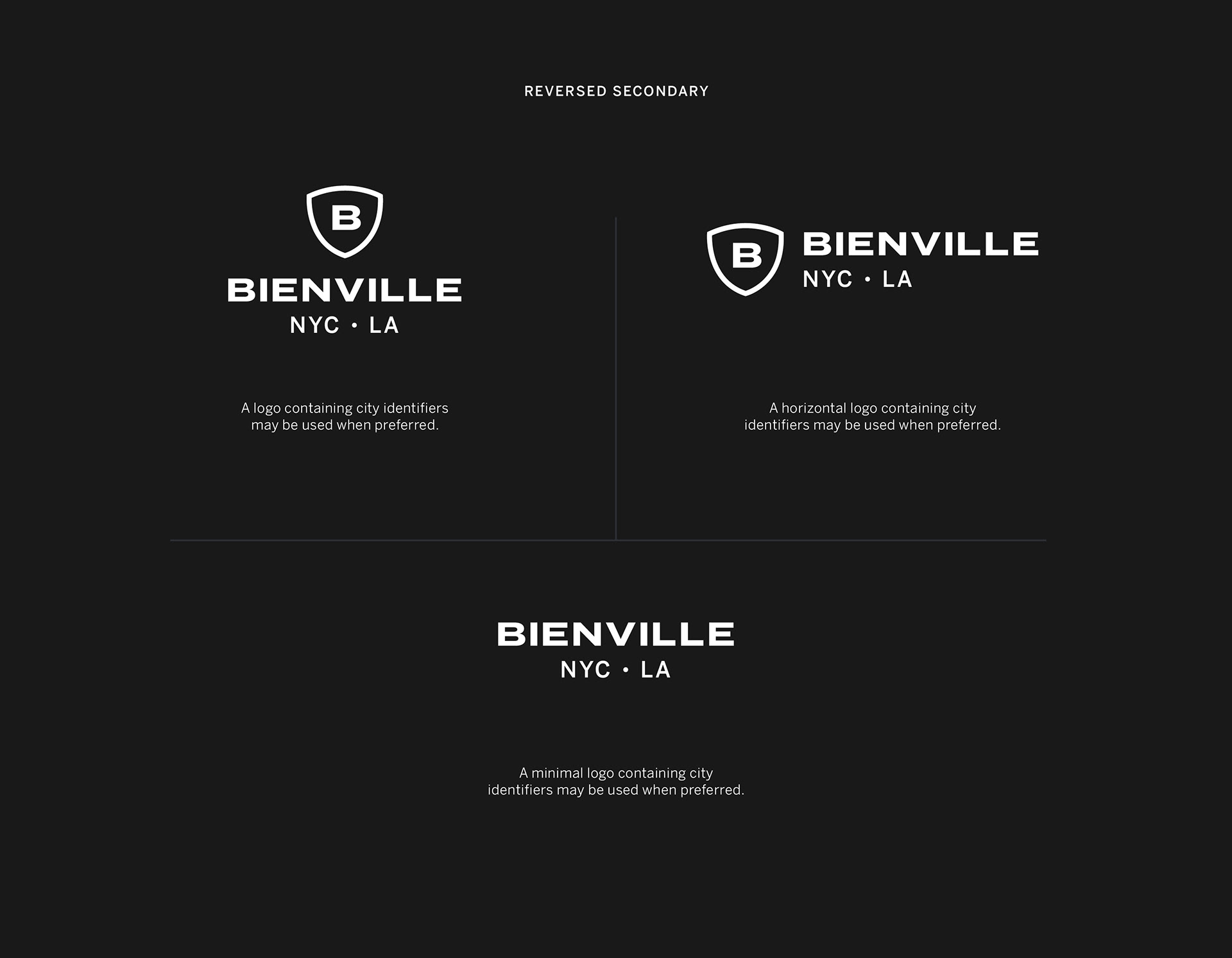
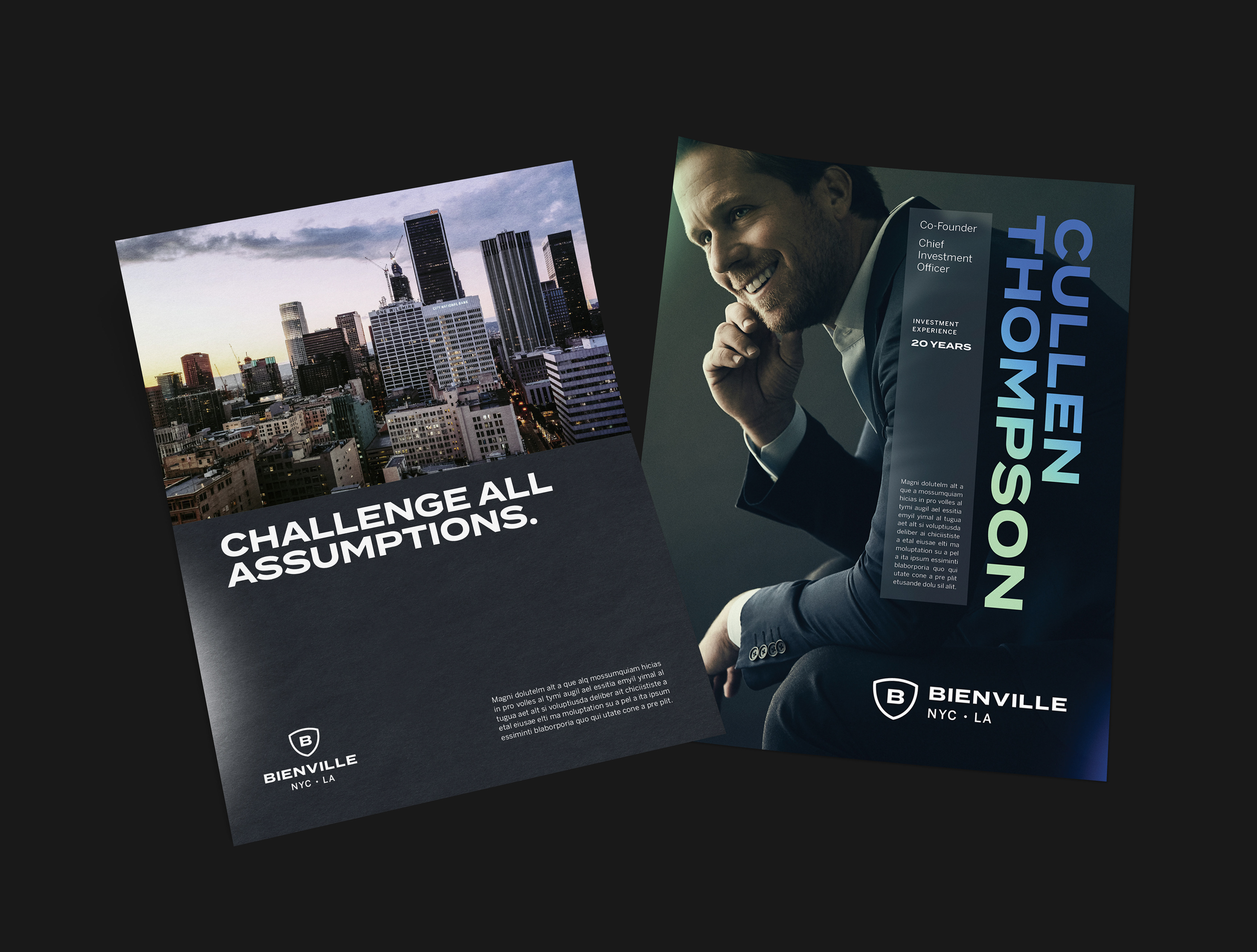
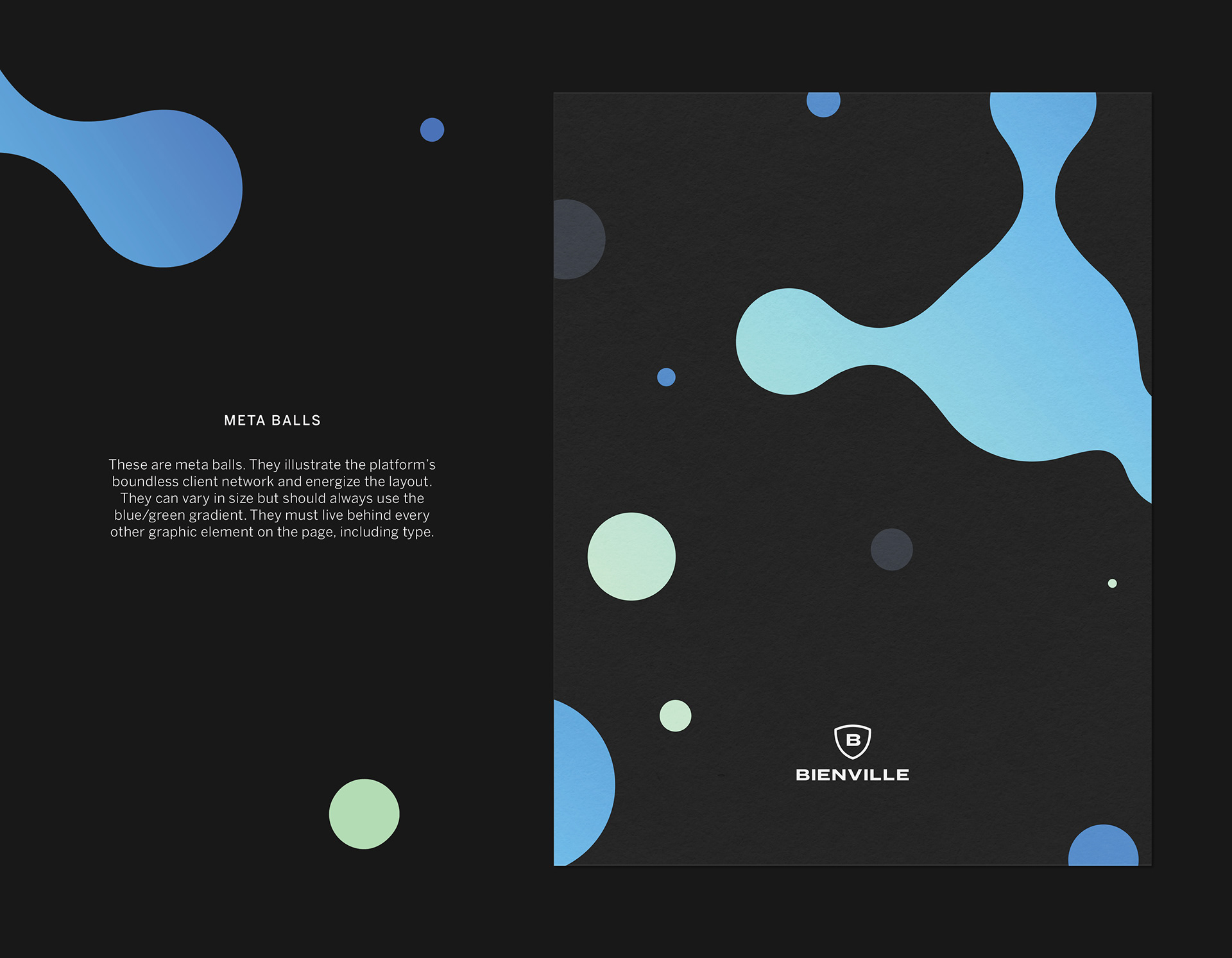
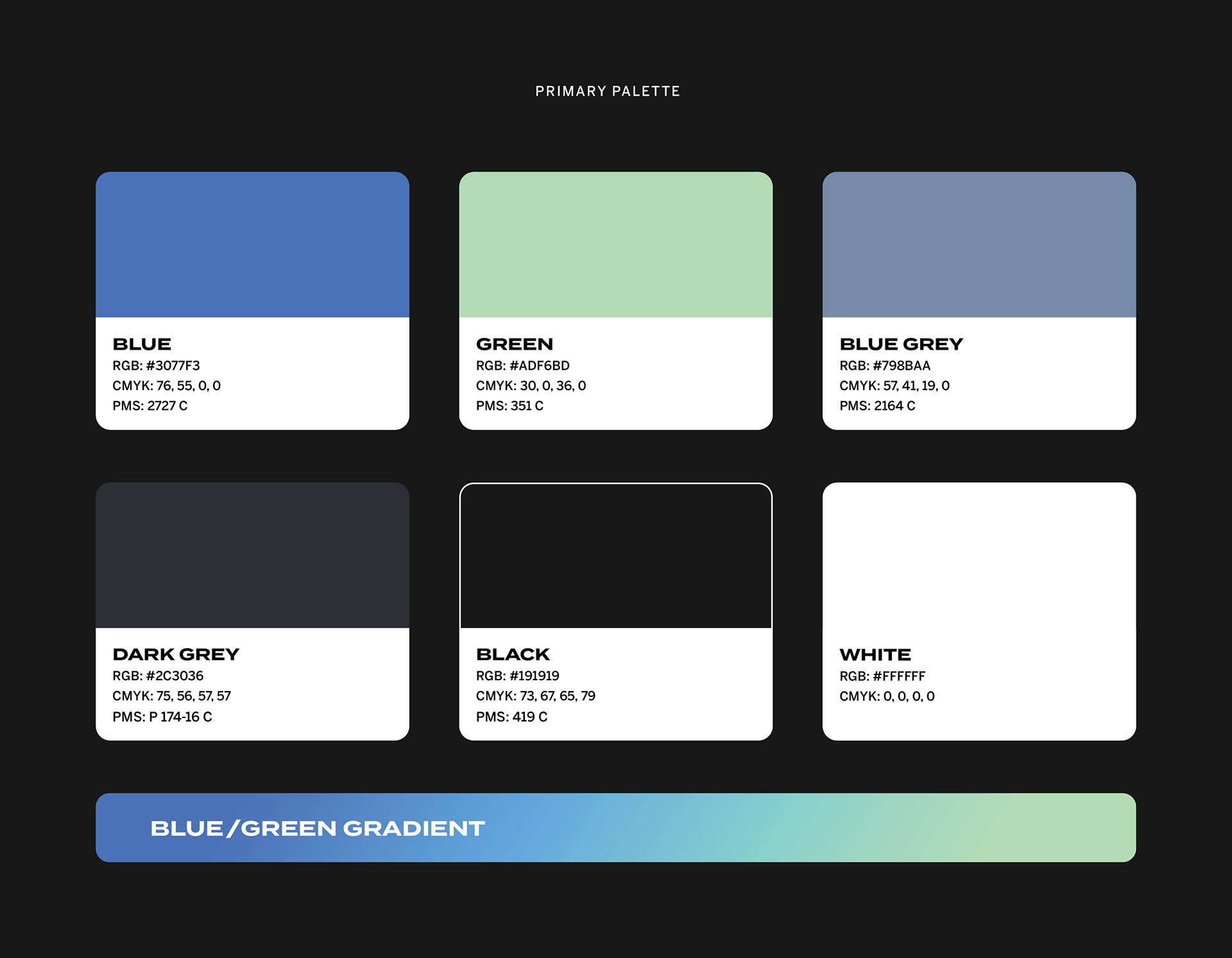
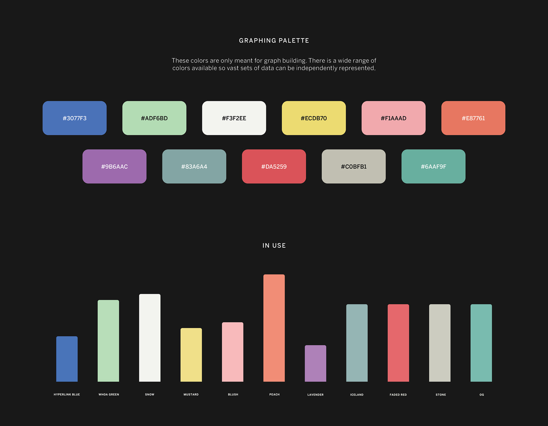
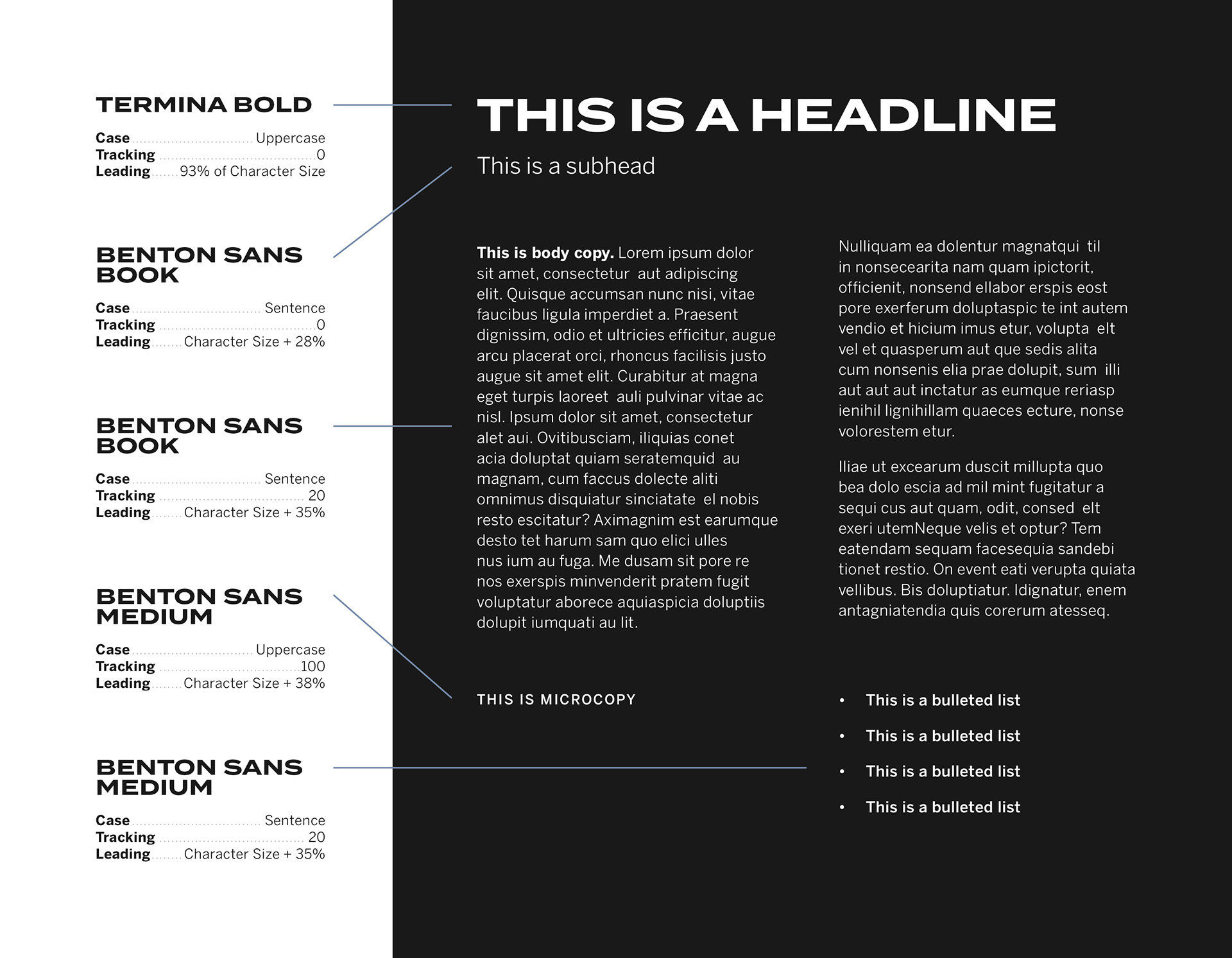
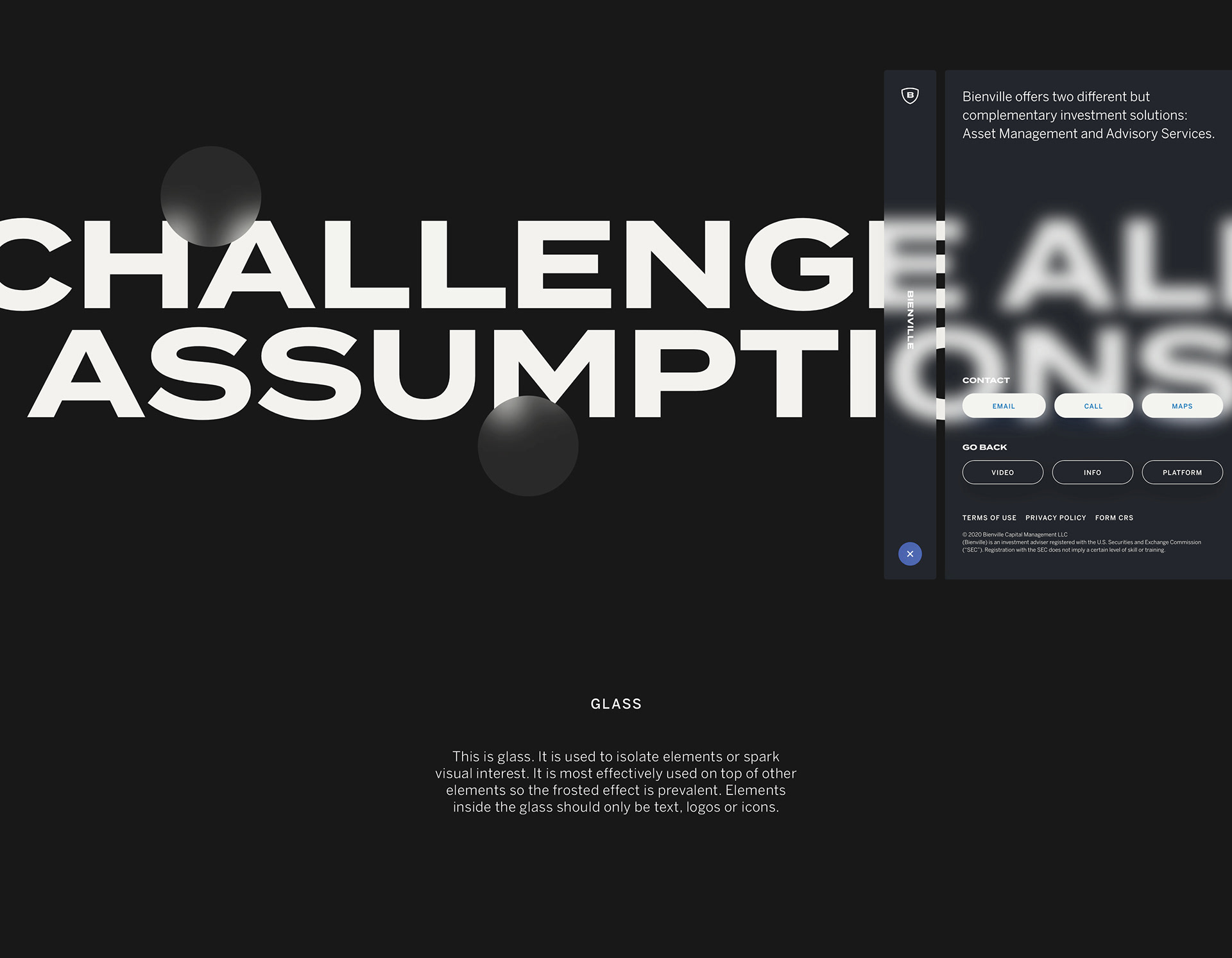
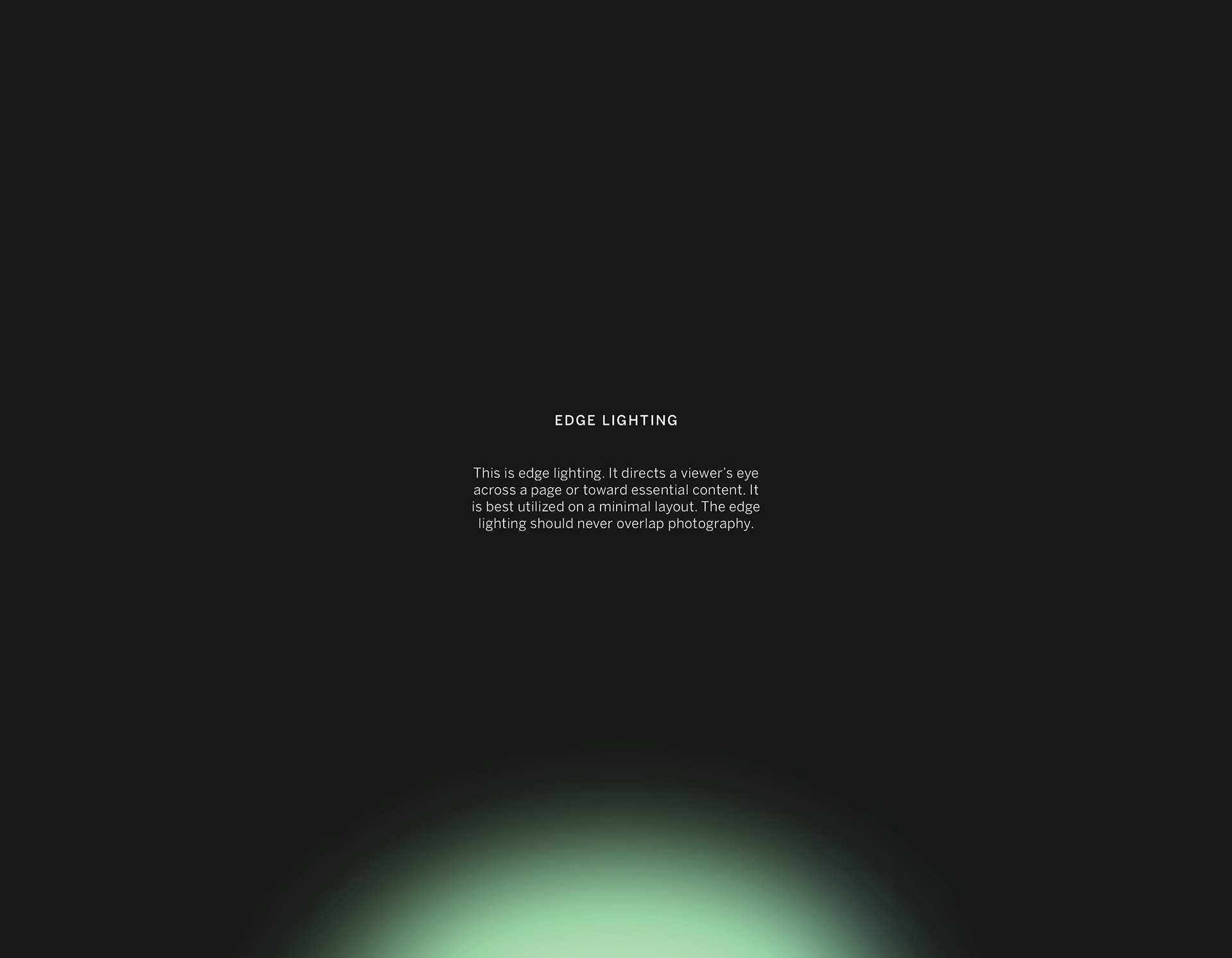
Supporting the new logo is a compilation of visual tools to communicate a tech-forward approach to investment.

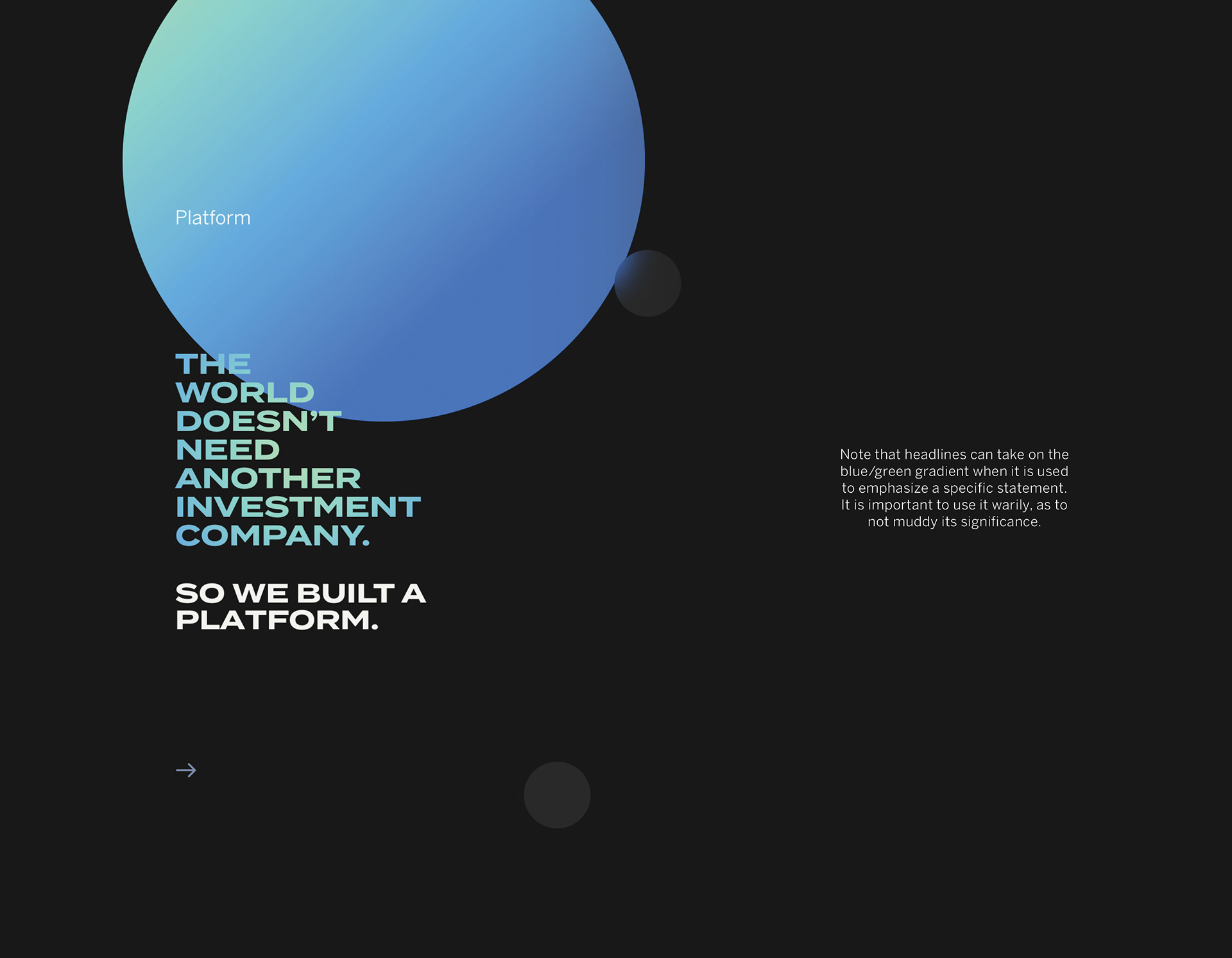
The website experience is unlike anything in the financial services category, employing a horizontal scroll, full frame video and compelling animations. All synched to your mouse movements (and your cursor is a meta ball too!).